


- Search
- Riyadh25 ° C


New logo, visual identity and rider equipment for Deliveroo, the on-demand food delivery service
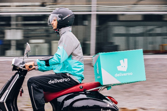
Deliveroo, the on-demand food delivery service, today unveils its new visual identity, logo and rider equipment.
Introducing the brand new Roo and a refreshed commitment to becoming a world-class food delivery service:
Designed in collaboration with branding agency DesignStudio, and leading road safety organisation, Brake, Deliveroo’s new look stands out as well as enhances its riders’ safety and comfort through specially designed new equipment. The new kit has undergone extensive testing and rider feedback, features hyper-reflective ‘flash’ material on the rider’s wrists, waist and shoulders to give the rider’s form maximum visibility at night for increased safety.
The vibrant new photographic and visual style sets the stage for Deliveroo’s next phase of growth. This week the food delivery service opens in its 100th city in Perth, Australia. In the UAE, Deliveroo will continue its expansion to cover zones towards the Creek and only then turn its attention to Abu Dhabi and Al Ain.
George Pallis, Director of Marketing, Deliveroo
“When Deliveroo launched in 2013, our design style was quite simple. Three years on, we’ve hit our hundredth city delivering to customers across 12 countries. We’re working with over 16,000 restaurant partners and have more than 20,000 riders on the road globally.
We remain committed to delivering great food. To reflect this we’re excited to adopt a wider colour palette and bolder photography style. And most importantly, we’re introducing an incredibly effective new rider kit designed for greater visibility in consultation with the road safety experts at Brake.”
James Hurst, Executive Creative Director, DesignStudio:
“We worked with people all over the world to ensure the new logo and visual identity is as relevant in Hong Kong as Hackney – a visual shortcut that works across languages and cultures and always points back to Deliveroo’s passion for good food. As the business grows, this updated look will accelerate, amplify and deepen Deliveroo’s relationships with restaurants, riders and customers."


